The children are aged between 3 years 4 months and 4 years 1 month
The Time Sampling example shows the number of children using each area of an Education Nursery
at every five minutes during the morning session.
The results are collated in a prepared chart and can then be presented as a graph, bar chart or
pie chart.
A chart to record Time Sampling observation data
Activity/Time
10:00
am 10:05
am 10:10
am 10:15
am 10:20
am 10:25
am Total
number of children
Home Corner
4
4
4
4
2
2
22
Water
1
2
1
2
2
3
11
Sand
2
2
1
1
6
Painting
2
2
4
Baking
4
4
2
2
1
13
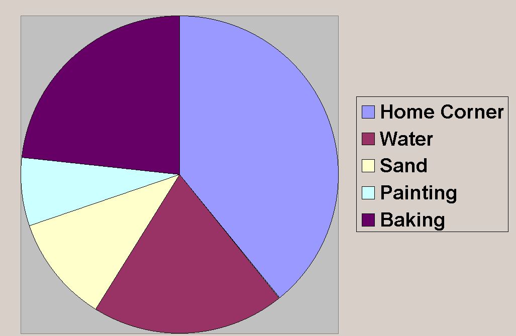
An example of a pie chart
A pie chart to represent the number of children playing in each nursery area
The children are aged between 3 years 4 months and 4 years 1 month
An example of a bar chart
A bar chart to represent the number of children playing in each nursery area
Charts can be easily drawn using Microsoft Excel.
The children are aged between 3 years 4 months and 4 years 1 month
